When Thames Ironworks FC was formed on 29 June 1895, one of the first tasks Arnold Hills and his committee needed to complete was to find the team a new kit.
Many clubs did not sew their own crest onto their strips in the late 19th century, with players instead sewing their national badge onto their club shirt after representing their country. In their first season of play, 1895/96, Thames Ironworks were no different.
In 1896, the Club introduced its first crest which was, fittingly for a team which drew players from all over the British Isles from the Ironworks’ diverse workforce, the Union Jack. Above and below the crest, the wording ‘TIW FC’ was sewed on.
However, this crest, which also appeared on the 2016/17 Umbro third kit (pictured above) worn in the Betway Cup tie with Juventus at London Stadium, was used for just one season before being removed.
For the next 27 years, the Hammers – a nickname derived from the riveting hammers used by shipbuilders to fasten parts of the vessel together – wore a shirt without a crest.
The next time one appeared on West Ham’s shirts was for the historic 1923 FA Cup final with Bolton Wanderers – the first final to be played at the new Empire Stadium in Wembley.
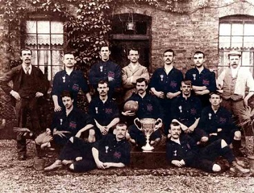
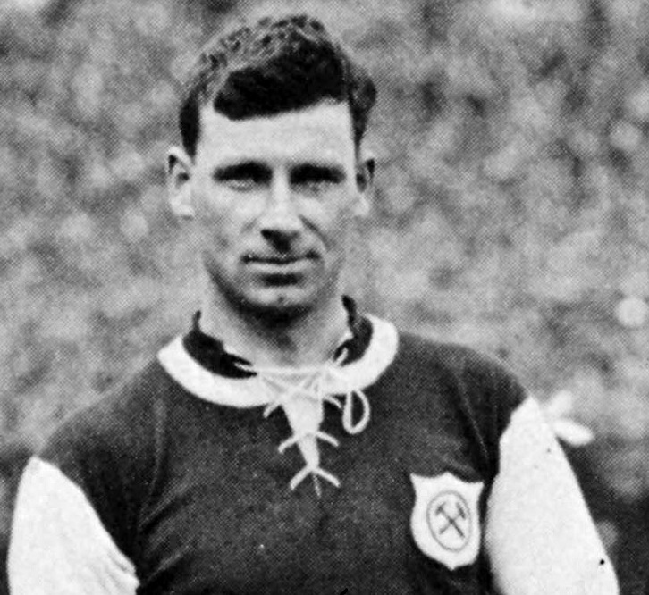
That afternoon, the estimated 200,000-strong crowd saw captain George Kay (pictured, below) lead his team out in claret and blue shirts adorned with an ‘elegant’ shaped crest containing, for the first time, the now world-famous ‘crossed hammers’ symbol denoting two riveting hammers.
The crest then disappeared for another 27 years before reappearing in a similar form in 1950, when the Hammers were then a Second Division club. It remained on the Club’s shirts for five seasons before taking a three-year break between 1955-58.
During the same decade, the players often wore blazers to official functions and events and these too were adorned with sewn-on crests. For the first time, these designs included an image of the ‘Boleyn Castle’, the building named Green Street House which sat next to the Club’s Boleyn Ground stadium in Upton Park.
In 1958, in celebration of West Ham’s return to the top flight, the crossed hammers returned inside a ‘classic’ shaped crest which would remain on the shirts for most of the next nine seasons.
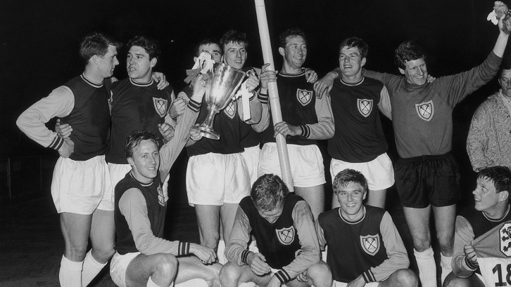
One notable exception came in May 1965, when Ron Greenwood’s team returned to Wembley for the European Cup Winners’ Cup final, complete with a ‘renaissance’ shaped crest containing the crossed hammers and, for the first time, the Boleyn Castle (pictured, below).
Crests then disappeared from West Ham shirts – aside from a two-month period in 1967 – until the 1975/76 season, when the Club introduced a design featuring a large Boleyn Castle behind the classic crossed hammers.
In 1980, a ribbon was added underneath the crest containing the words ‘West Ham United’ and this design – save for a return to the plain crossed hammers between 1983-85 – remained on the shirts for the next 36 years, with slight variations in style and colour. The crest used between 1998-2016 can be seen below, left.
In 1995, to mark the centenary of the formation of Thames Ironworks FC, the Club added two figures to a special commemorative crest, one wearing the Ironworks’ red, white and blue colours from 1897, including a blue cap, and the other dressed in the modern claret and blue kit.
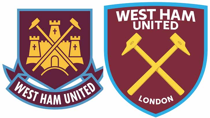
The most-recent change to the crest came in summer 2016, with a new shape based on the bow of HMS Warrior, the first armour-plated, iron-hulled warship built and launched at Thames Ironworks in 1860.
The claret and blue colours remain prominent, with a new, modern, digital-friendly typeface and the addition of the word ‘London’ (pictured above, right), in reference to both the Club’s move to the Olympic Stadium on Queen Elizabeth Olympic Park and its growing global standing.